Tech stack
Overview
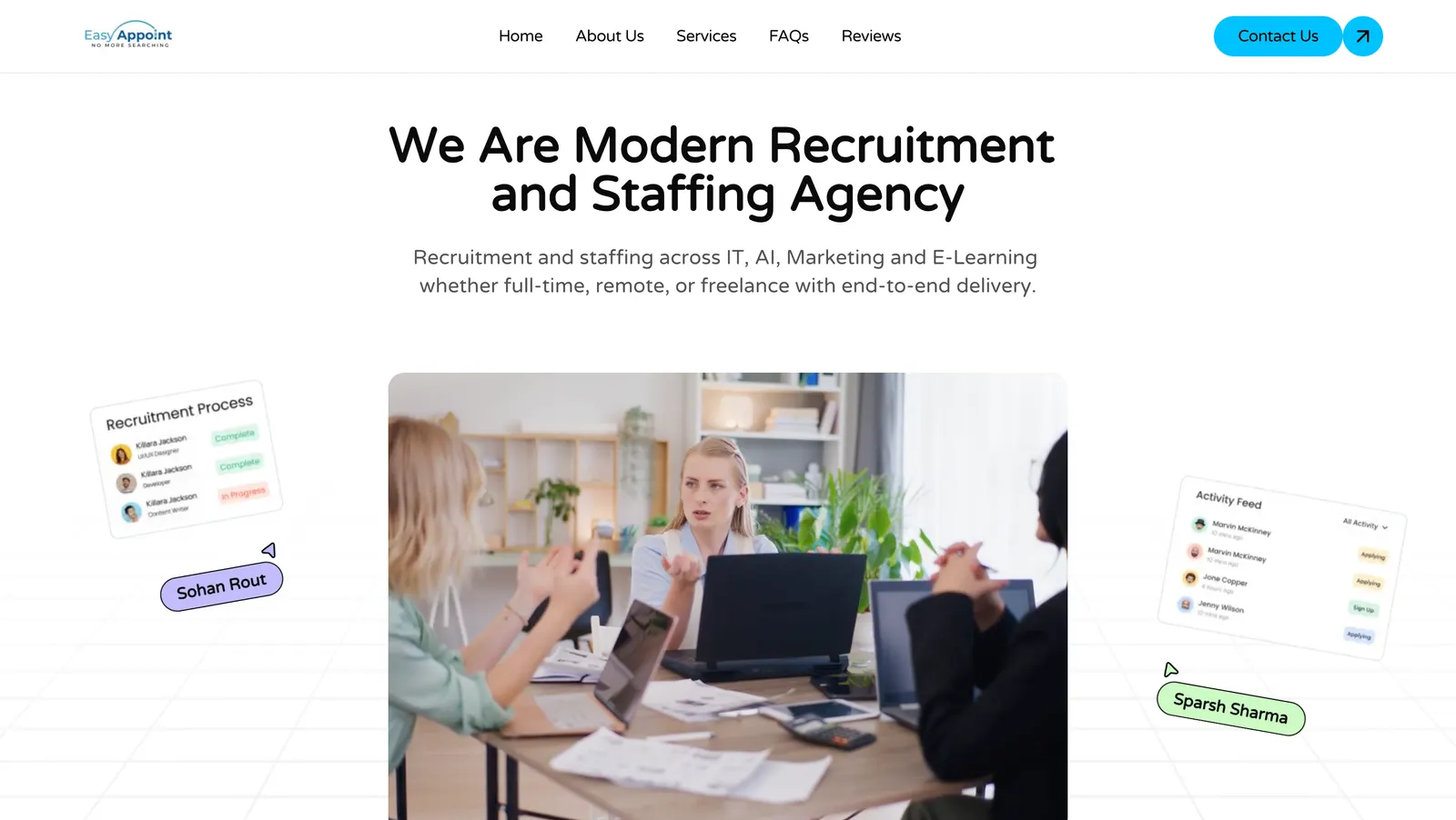
Easy Appoint is a recruitment and staffing agency placing candidates across IT, AI, Marketing and E-Learning, on full-time, remote and freelance terms. They needed a website that did one thing well: convert visitors into qualified enquiries.
That framing shaped every decision. This is not a brochure site with a contact page bolted on the end. It is a lead generation asset where the page structure, the copy hierarchy, and the placement of every call to action serve the enquiry form. The brand line, No More Searching, set the tone: the site itself had to feel like the end of a search rather than the start of another one.
The Problem
Recruitment is a low-trust, high-competition category. A prospective client landing on an agency site is asking three questions within the first few seconds:
- ▸Do they recruit for my sector?
- ▸Have they done this for companies like mine?
- ▸How quickly can I talk to a human?
Most agency sites answer the first question well and the other two badly. Sector coverage gets buried in a services grid, proof is missing entirely, and the contact route is a single link in the footer. Visitors leave to compare options and never come back.
Approach
We structured the page as a sequence that answers those three questions in order, then removes every obstacle between the visitor and the enquiry.
- ▸Lead with the category, not the brand. The hero states plainly what the company is, a modern recruitment and staffing agency, rather than opening with an abstract slogan. Visitors self-qualify immediately.
- ▸Put sector coverage in the subheading. IT, AI, Marketing and E-Learning, along with full-time, remote and freelance engagement models, appear directly under the headline. The most common disqualifying question is answered above the fold.
- ▸Show the process, not just the promise. The hero visual surfaces the recruitment pipeline and live activity as interface fragments, making an invisible service feel concrete and in motion.
- ▸Make proof a first-class section. Reviews sit in the primary navigation rather than being buried, because third-party validation is what moves a hesitant visitor in this category.
- ▸Keep contact permanently reachable. A high-contrast Contact Us action is pinned in the header, so the conversion route is available from any scroll position without hunting.
Design Decisions
A light, high-clarity interface was a deliberate departure from the dark, agency-typical aesthetic. Recruitment buyers are frequently HR and operations leads evaluating vendors during a workday, so legibility and a sense of straightforwardness matter more than visual drama.
Within that restraint, colour does specific work. The palette stays near-neutral so that the single blue call to action is the most visually prominent element on the page, with soft accent tones reserved for status indicators in the interface fragments. Nothing competes with the conversion action.
Generous whitespace and a large type scale keep the page scannable, since a meaningful share of visitors skim rather than read. Motion is used sparingly, to draw attention to the process visuals rather than to decorate the page.
Challenges
Making an intangible service feel real. Recruitment has no product to photograph. Rather than relying on stock imagery alone, we rendered fragments of the working process (a candidate pipeline with progress states, a live activity feed) as interface elements around the hero. The service becomes visible without overstating what the agency actually operates.
Balancing sector breadth against focus. Covering four sectors and three engagement models risks reading as unfocused. We resolved this by naming the sectors precisely in a single supporting line instead of expanding each into its own competing section, keeping the promise broad but the message tight.
Designing for comparison shopping. Visitors in this category open several agency sites at once. The site is built so that its core proposition is legible in a few seconds of skimming, on the assumption that it is being read alongside three competitors rather than in isolation.
Learnings
Lead generation sites are won in the page structure, not the visual polish. The ordering of sections, the position of the enquiry route, and the speed at which a visitor can disqualify themselves matter more to conversion than any individual component.
For service businesses without a product to show, credibility has to be constructed. Process visuals, named sectors, and visible reviews each do more work than descriptive copy, because they let the visitor verify a claim instead of being asked to accept one.
The clearest lesson was about restraint. Every additional call to action, section, and visual flourish dilutes attention. A site with one job should be designed so that job is the most obvious thing on the page.
Related case studies
Digital Ecommerce Store
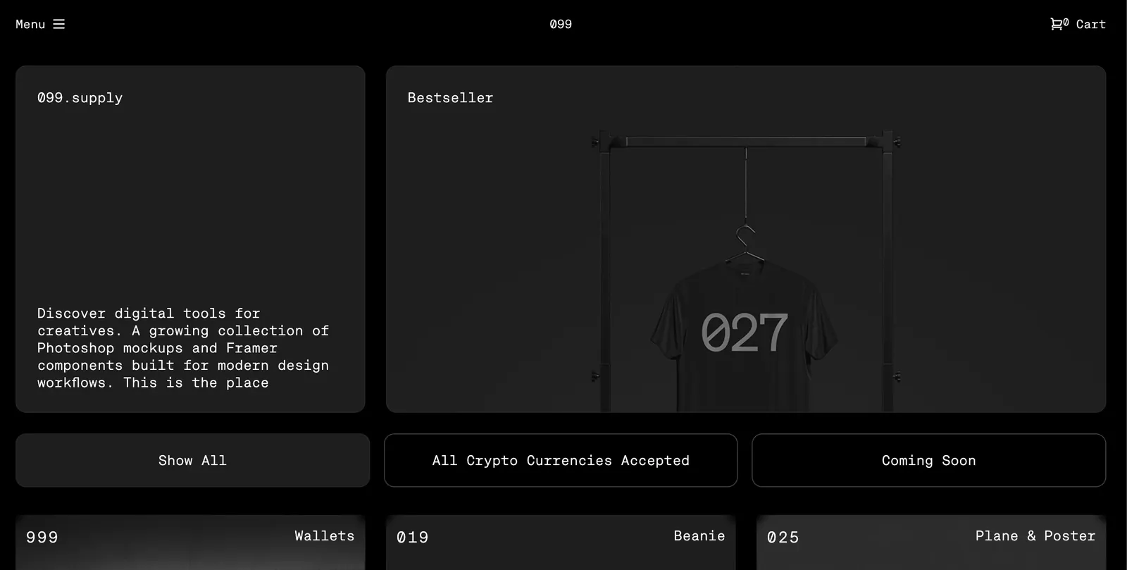
A fullstack digital ecommerce store created to sell digital products. Customers can buy digital products and pay using crypto currency they like.
Uniprep
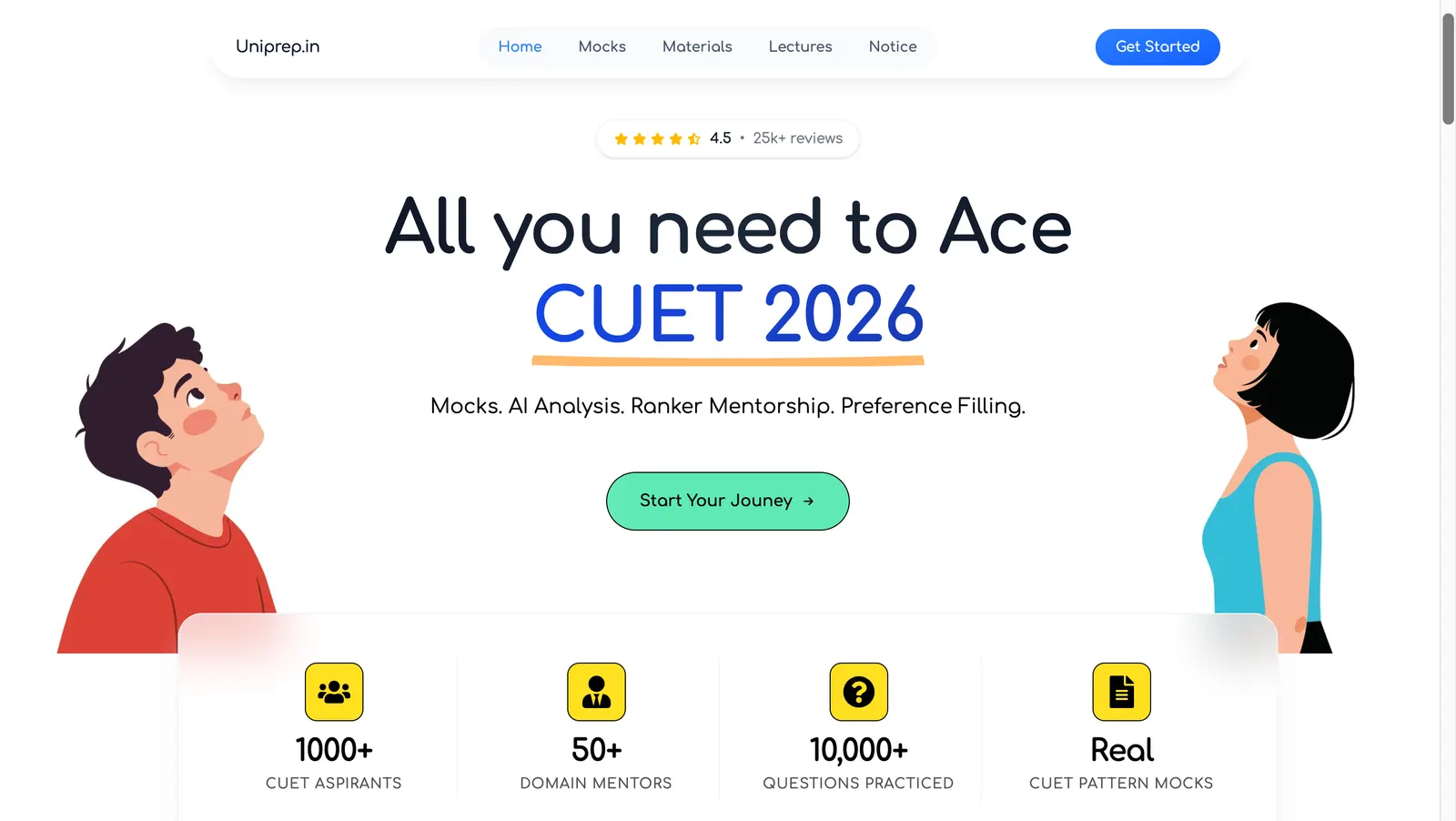
A CUET preparation platform built for a client selling courses and mock tests directly to students. The build spans three parts: a student-facing experience designed from scratch, Razorpay integration for collecting payments, and a dedicated CMS admin panel that lets the client author and manage mock tests without a developer.