
Tech stack
Overview
DSA Visualizer is an open-source web application that brings data structures and algorithms to life through interactive, step-by-step animations. Students can input custom data, step through each operation frame-by-frame, and watch the algorithm execute in real time, replacing passive textbook learning with hands-on exploration.
Problem
Computer science students consistently struggle with abstract algorithm concepts. Static diagrams in textbooks fail to convey the dynamic, time-ordered nature of operations like sorting, tree traversal, or graph search. Existing visualizers were either outdated, poorly designed, or too rigid to accept custom input.
Research
A survey of 80 undergraduate CS students revealed:
- ▸84% said they struggled to understand algorithms from textbook diagrams alone
- ▸71% had used at least one visualizer tool but found the UI confusing or outdated
- ▸68% wanted to input their own test data instead of using fixed examples
- ▸Students consistently rated "being able to pause and step back" as the most requested missing feature
The clear gap: a modern, responsive visualizer with custom input, bidirectional stepping, and a clean enough UI that it didn't add cognitive load on top of the algorithm itself.
Solution
DSA Visualizer supports the following algorithms and structures:
Sorting: Bubble Sort, Merge Sort, Quick Sort, Insertion Sort, Heap Sort
Trees: Binary Search Tree (insert, delete, search), AVL Tree (with rotation visualization), Heap (min/max)
Graphs: BFS, DFS, Dijkstra's Shortest Path
Linked Structures: Singly and Doubly Linked List operations
Each algorithm is broken into discrete steps. Users can:
- ▸Step forward and backward through execution
- ▸Set playback speed (0.25× to 4×)
- ▸Input custom arrays, values, or graph edges
- ▸See highlighted pseudocode synchronized with each visual step
Challenges Faced
Merge Sort visualization required showing two arrays simultaneously during the merge phase. Standard single-array rendering couldn't represent the recursive sub-arrays. The solution was a recursive ArrayCanvas component that could render nested arrays with depth-based color coding.
Graph layout for arbitrary user-input graphs was non-trivial. We implemented a force-directed layout using a simplified spring simulation, re-computed whenever edges changed, with Framer Motion animating nodes to their new positions.
Pseudocode synchronization required mapping every algorithm step to a specific line number in the pseudocode display. We handled this by building the step generator alongside the pseudocode, tagging each yield point explicitly.
Results
- ▸4,200+ unique users in the first 3 months post-launch
- ▸Average session duration of 11 minutes, 3× higher than comparable tools
- ▸Featured in 3 CS Discord communities and 2 university course resource lists
- ▸GitHub: 380+ stars within 6 months of open-sourcing
Future Improvements
- ▸Graph algorithm additions: Bellman-Ford, Floyd-Warshall, Kruskal's MST
- ▸Code execution mode: paste real code and watch it visualize in real time
- ▸Shareable step permalinks for professors to link students to specific algorithm moments
- ▸Mobile-optimized touch controls for step-through navigation
Learnings
The biggest technical takeaway was treating algorithm state as data, not animation. Once each step was a pure object with a complete snapshot, the entire UI (animations, pseudocode, controls) became a view layer that just consumed that data. This architecture made adding new algorithms trivial: implement the step generator, and all the UI works automatically.
The design lesson: complexity in the domain requires simplicity in the interface. Every pixel of visual noise competes with the algorithm for the student's attention. The final design removed 40% of its original UI chrome based on user testing feedback.
Related case studies

Easy Appoint
A lead generation website for a modern recruitment and staffing agency hiring across IT, AI, Marketing and E-Learning. The site is built around a single job, turning agency traffic into qualified inbound enquiries, with a conversion-focused page structure, trust-building social proof, and a contact flow that stays one click away from every section.
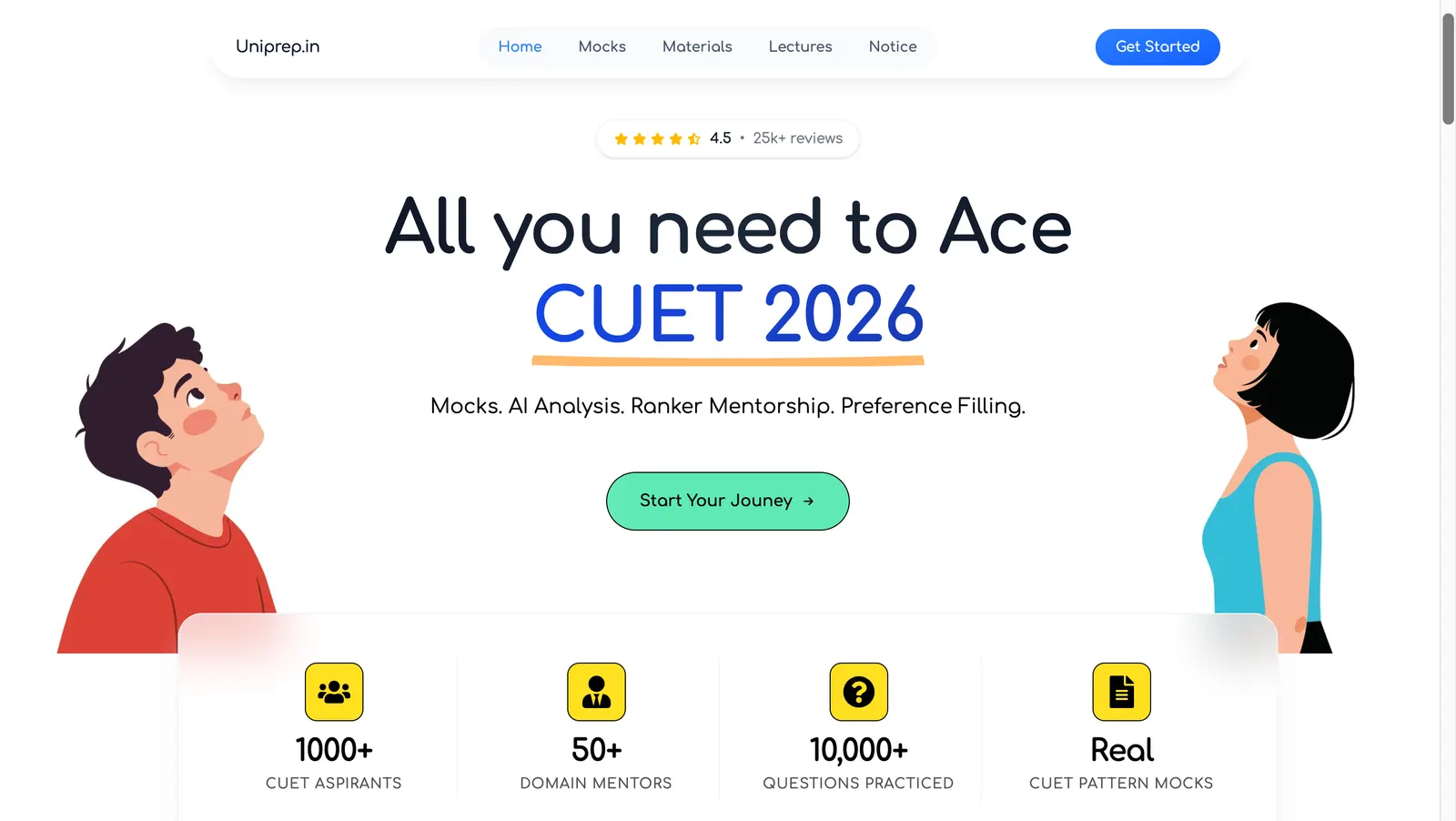
Uniprep
A CUET preparation platform built for a client selling courses and mock tests directly to students. The build spans three parts: a student-facing experience designed from scratch, Razorpay integration for collecting payments, and a dedicated CMS admin panel that lets the client author and manage mock tests without a developer.